
Monday, March 31, 2014
Project 8 - Research
Four Examples of Pixel Art:


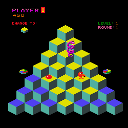
Four Examples of Isometric Levels:


Pixel Art Walk Cycle:

Tuesday, March 25, 2014


Project 7 - Participation
My Comments:
I like the background and the text but I feel like when it transitions and flashes to the next background it happens a little too suddenly, maybe have it fade to the next color. -jaromando
I really like the fire effects behind the text make it look like the text is being singed. - mbfishman
The way you show your logo animate in different angles makes it really cool, I really like how you put it all together at the end. -dnkhan
All of the animations go together really well, making it look like it is glitching out almost. Really well done. -edleclair
I like how the first two words drop in and bounce a little, maybe make the volcano look like it's erupting would add a lot to it. -mmensher
I like the simplicity about it, nothing too over the top and easy to read. -rperricelli
I think it looks really sick how the background slowly turns, maybe just remove the white at the end. -aweitzner
I like how everything simply fades in, maybe add a little more to the background or add a shadow effect to the Big L to add something else to it. -cryowan
Looking at my classmates comments about my logo makes me think that I should do a little more with it. I got that shadowy type of background I wanted but maybe having that solid black filled in around the logo isn't too good. Taking in some of the criticism, I think making my logo's font size a little larger and perhaps do a little more with the animation.
Wednesday, March 19, 2014


Tuesday, March 18, 2014
Project 7 - Presentation
I looked at Matt, Olivia, John, Brian, Ralph, Evan, Alex and Matt's animated game logo and talked with them about it.
Project 6 - Participation
My Comments:
I like the background with the title's font texture, it looks
good with the shadow effects of the font.
jaromando
The gradient font makes it look cool with the red outline.
The background really fits the game title.
Ademos
The font and textures
look really great. The little wing
emblem right behind it makes it look like it could be on a game cover as it is.
Bheisenberg
I really like how the font texture looks like it's been burnt
by the flames behind it.
Mbfishman
I like the creative
design but all the different colors overlapping the logo make it a little hard
to read, otherwise looks great.
Dnkhan
Looks really professional and well done, the similar color of blue to the font makes it a little difficult to read though.
Edleclair
I like the font, it's unique. The title and the gritty kind of texture for the lettering you use gives a good sense of what the game is about.
Mmensher
Everything fits together well, the night sky with the sky lights make it look really good.
Rperricelli
The background is really well done. The font really compliments the background well.
Aweitzner
The font looks nice with the gradient effects. Maybe add a background.
Cryowan
Looking at the comments my classmates wrote about my logo, I edited it a little more in photoshop to add more of a background to give a better feel for my logo.
Tuesday, March 4, 2014


Project 5 - Participation
My Comments:
I really like how all the pictures
you grouped together fit well with each other. All of the swatches you picked
out are very easy to see in each of the pictures. JArmando
I like how your images go well with
each other, making it feel like completely different levels. BHeisenberg
Your images really fit that creepy, eerie theme you're
going for. All of the images kind of feel like the same scene though. Mbfishman
I like how all of your
pictures are all futuristic with each moodboard still having a different
environment. Ogutierrez
Good images, very different environments
but for some of them some swatches look very similar. Dnkhan
I like your different images,
your first couple of moodboards remind me of the game Sleeping Dogs. Your swatches are pretty diverse, the only
thing I can think of that would help is if you moved the pictures closer
together. Edlecair
Good images and swatches,
besides the one beach image, the others look pretty similar to each other. Mmensher
Some of the moodboards’ images
don’t really seem like they go together too well but everything else looks
great. Rperricelli
I like your different pictures
showing different environments. Aweitzner
If I went back and edited it, I would definitely add more images to each moodboard and find more images to go along with those I've already made swatches for. Also in my moodboards, it is pretty unclear which board represents the player since I have multiple pictures with people in them. I could pair up the pictures with people in them and get different images to show environments/landscapes to represent different levels in my game.
Subscribe to:
Comments (Atom)